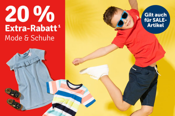
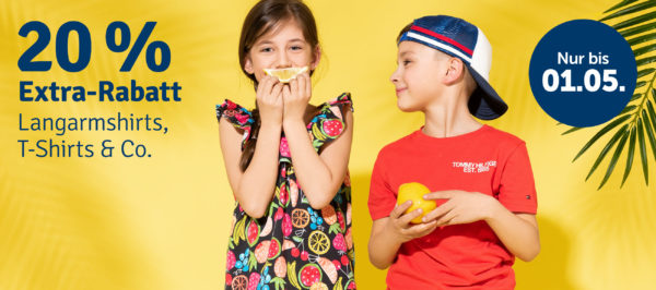
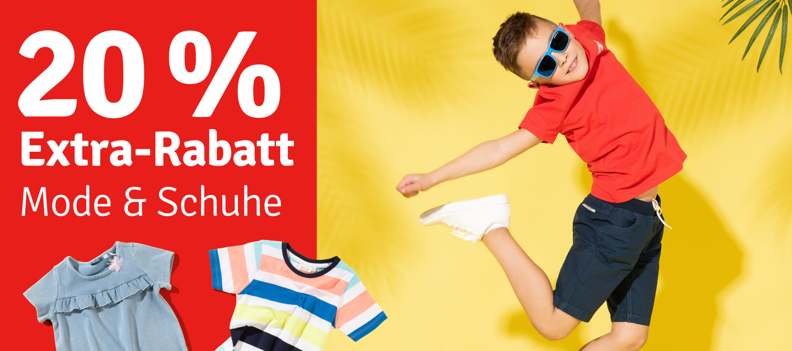
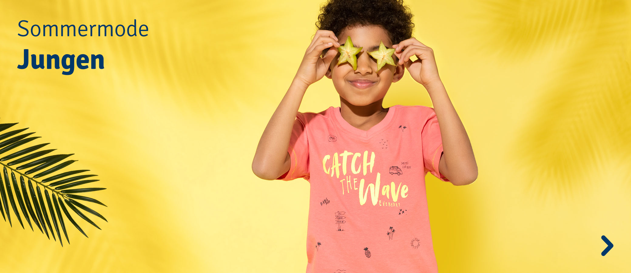
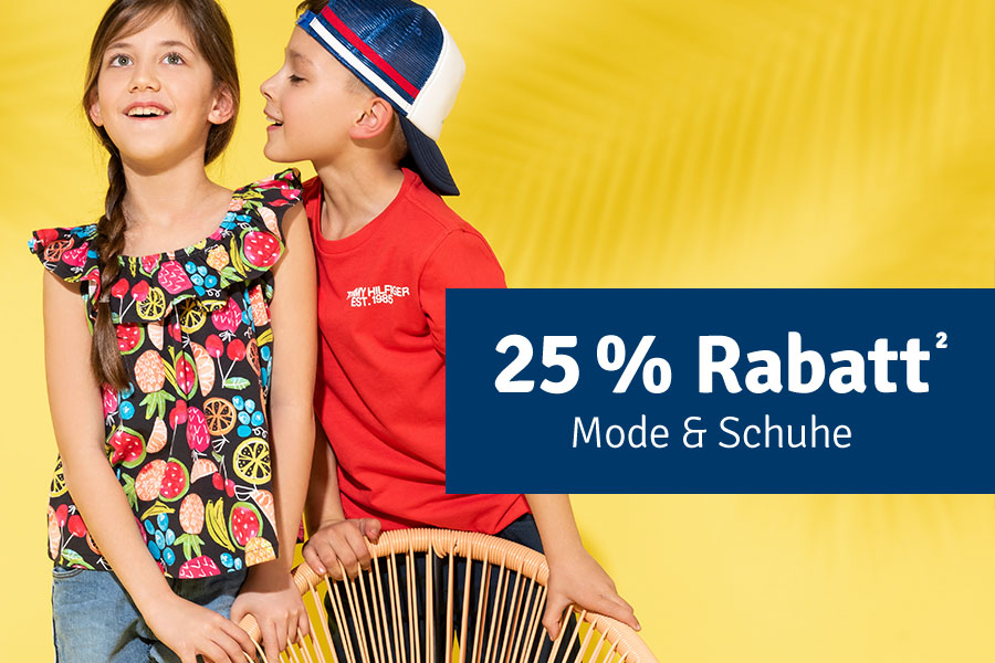
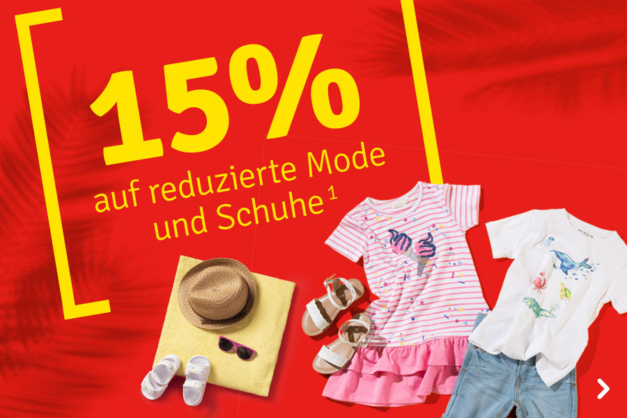
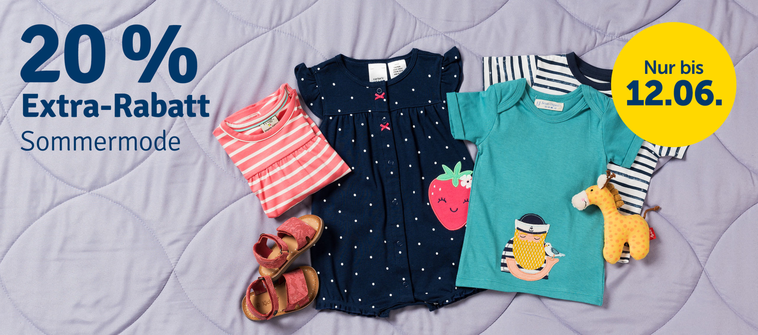
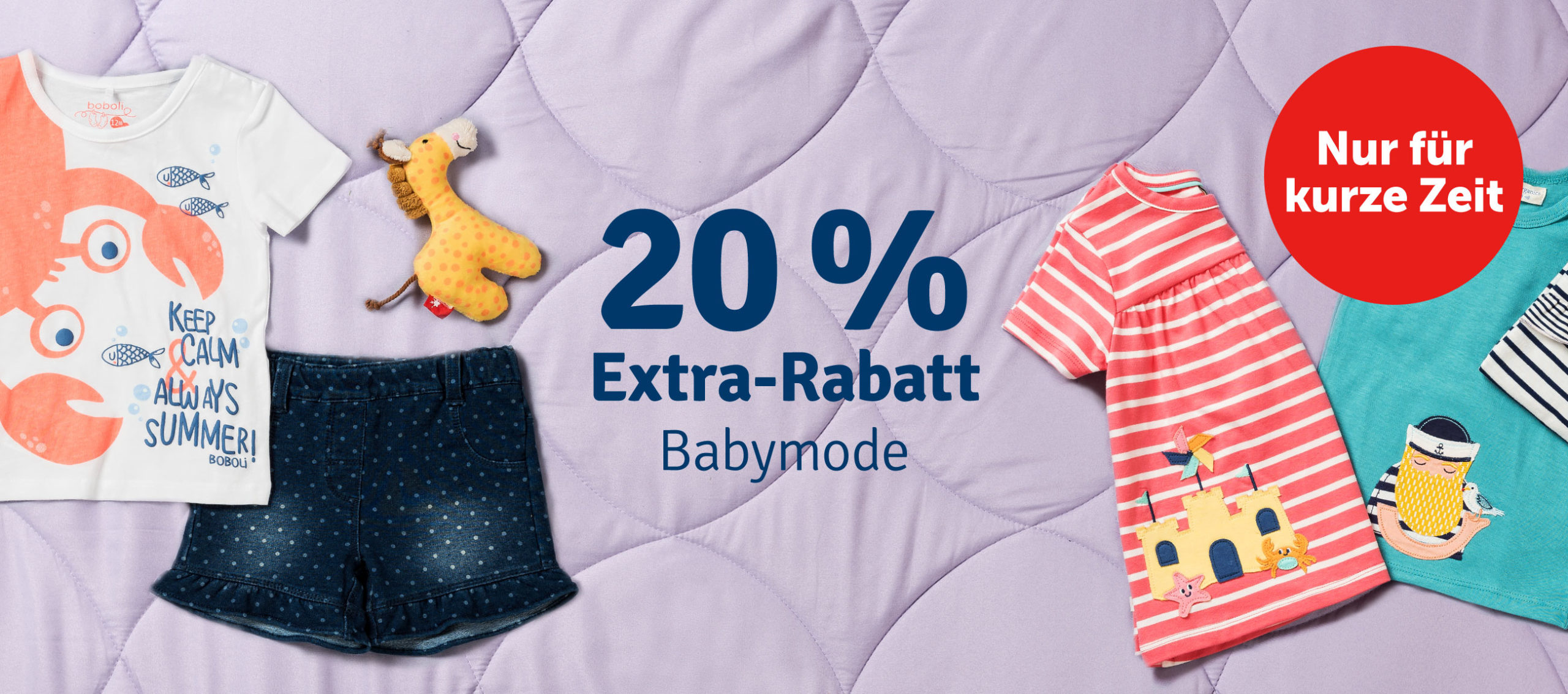
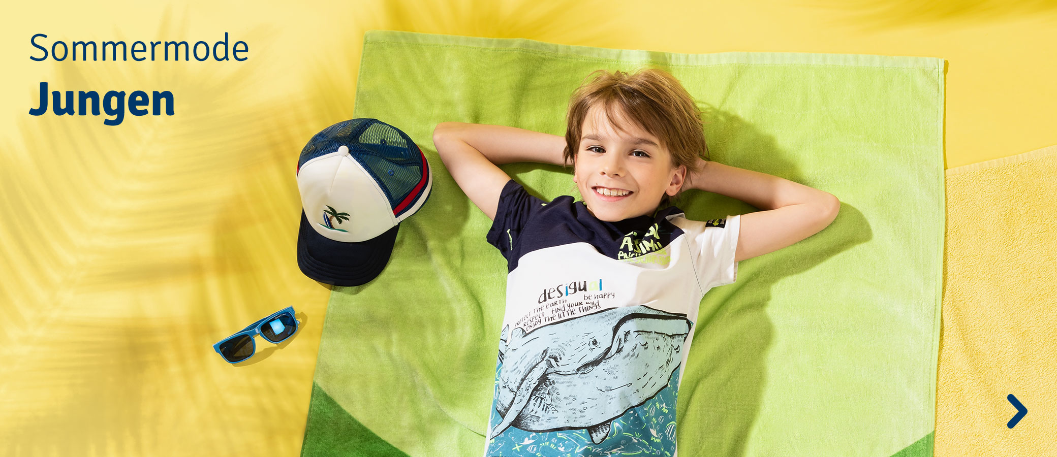
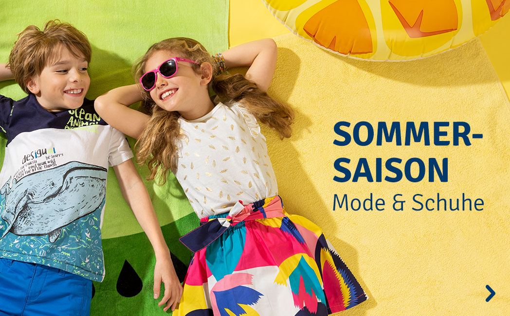
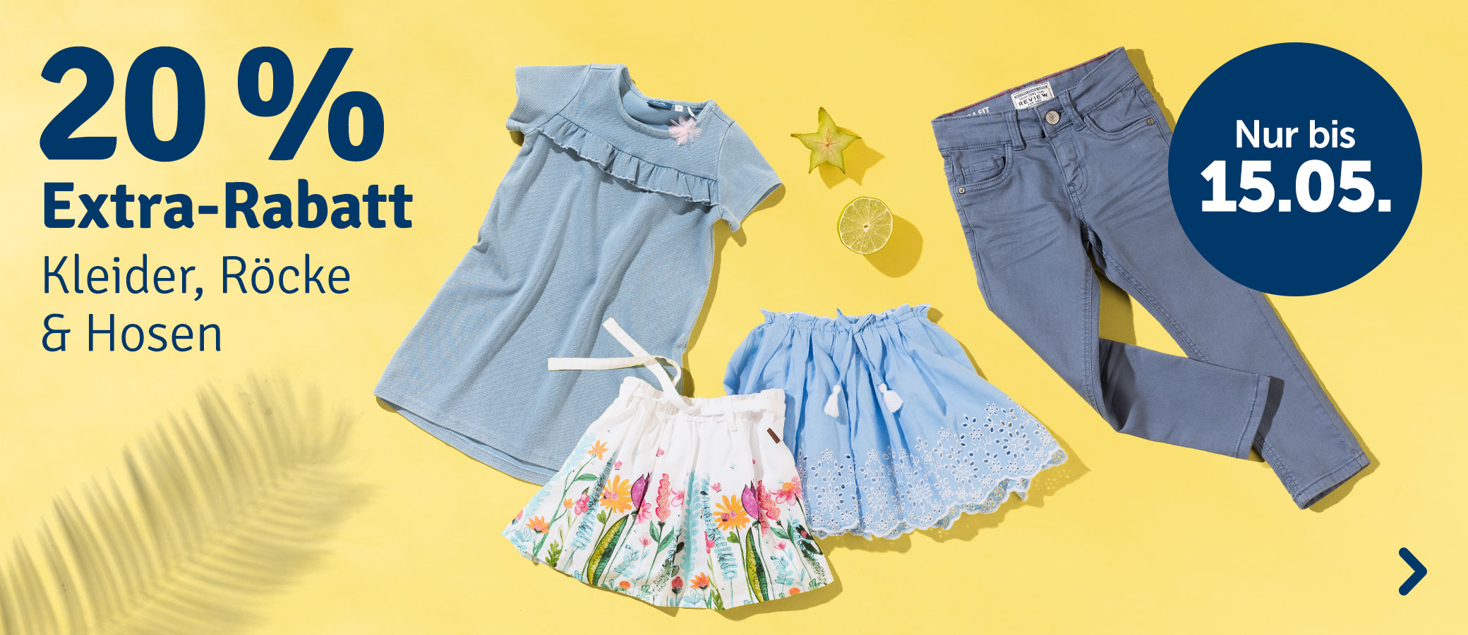
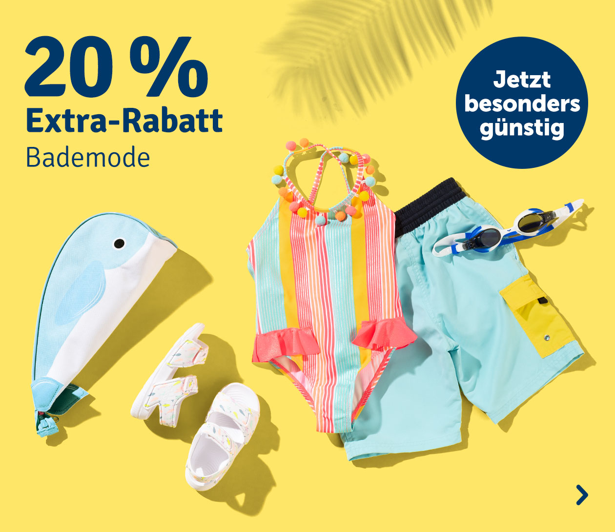
Kids' Summer Fashion
Project: Photoshoot, Landing Page Design
Date: 2019
Industry: Toys, Kids' Fashion
This summer campaign was shot for a big toy and kids’ fashion company. We used palm tree leaves to project shadows unto a bright background to create a summery effect and a backdrop for the models. The children themselves interacted with each other or played around with a selection of exotic fruits that we chose for them. We also incorporated the fruits as props for the product flat-lays. As a result the photo studio under my guidance produced very vivid and playful imagery that I could use further for digital editing and the implementation on the company's website.


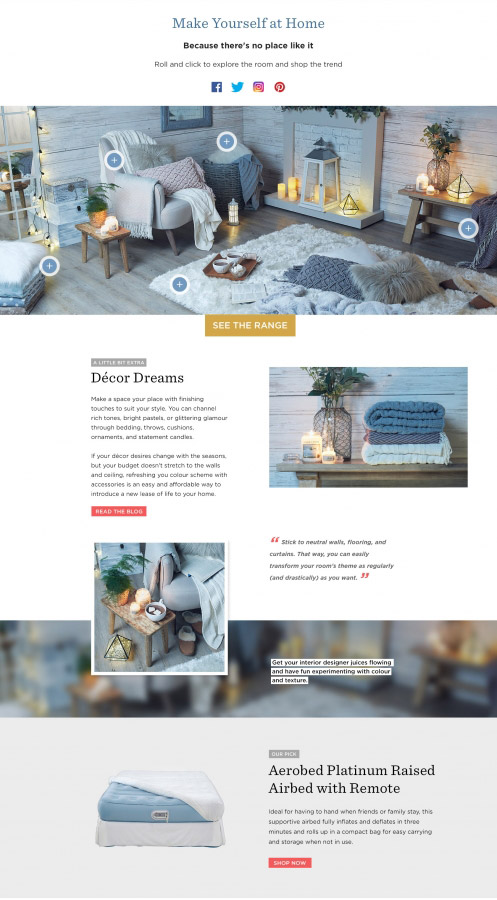
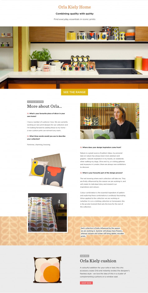
Inspirational Collections
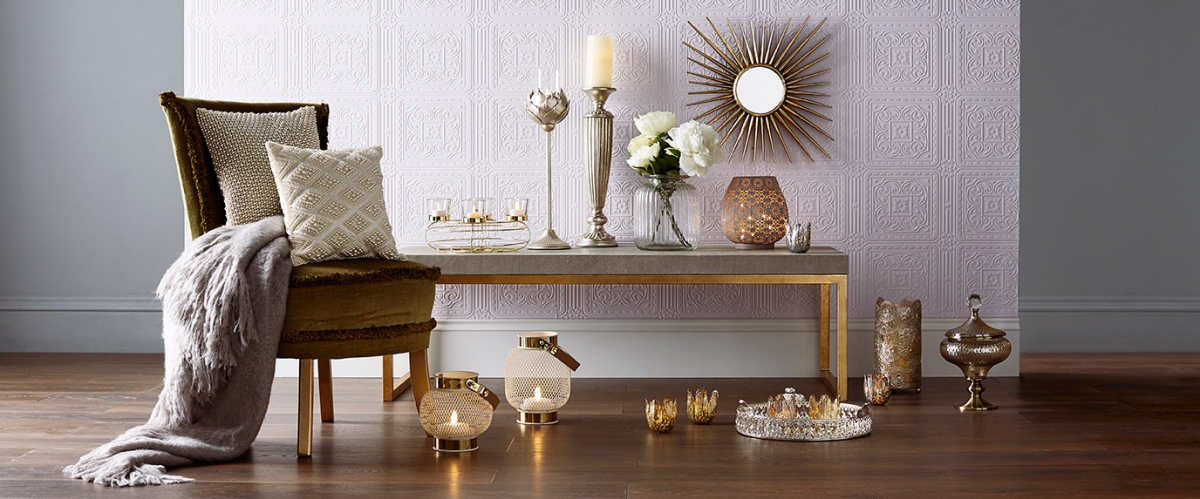
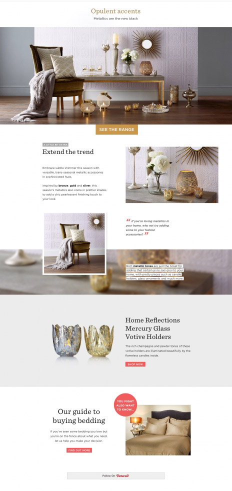
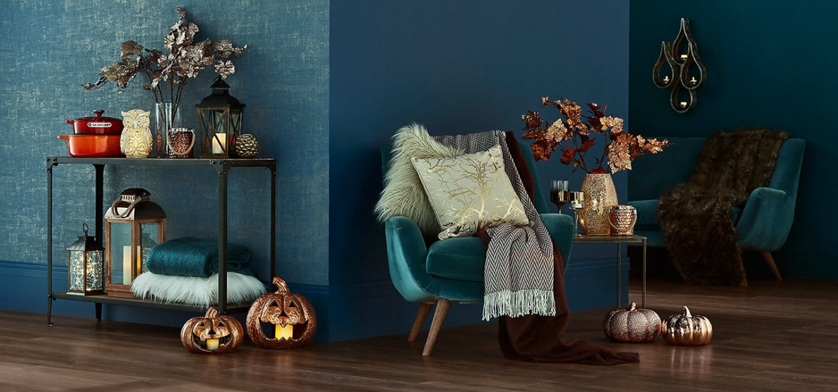
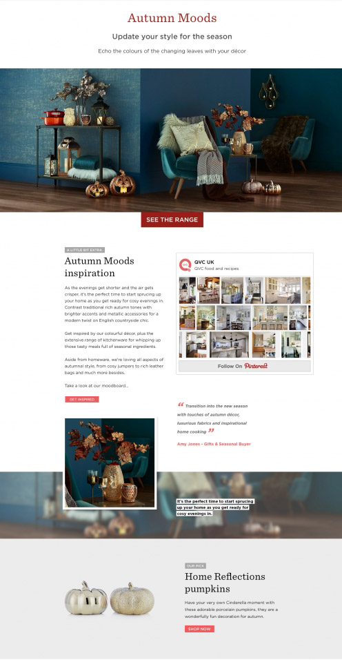
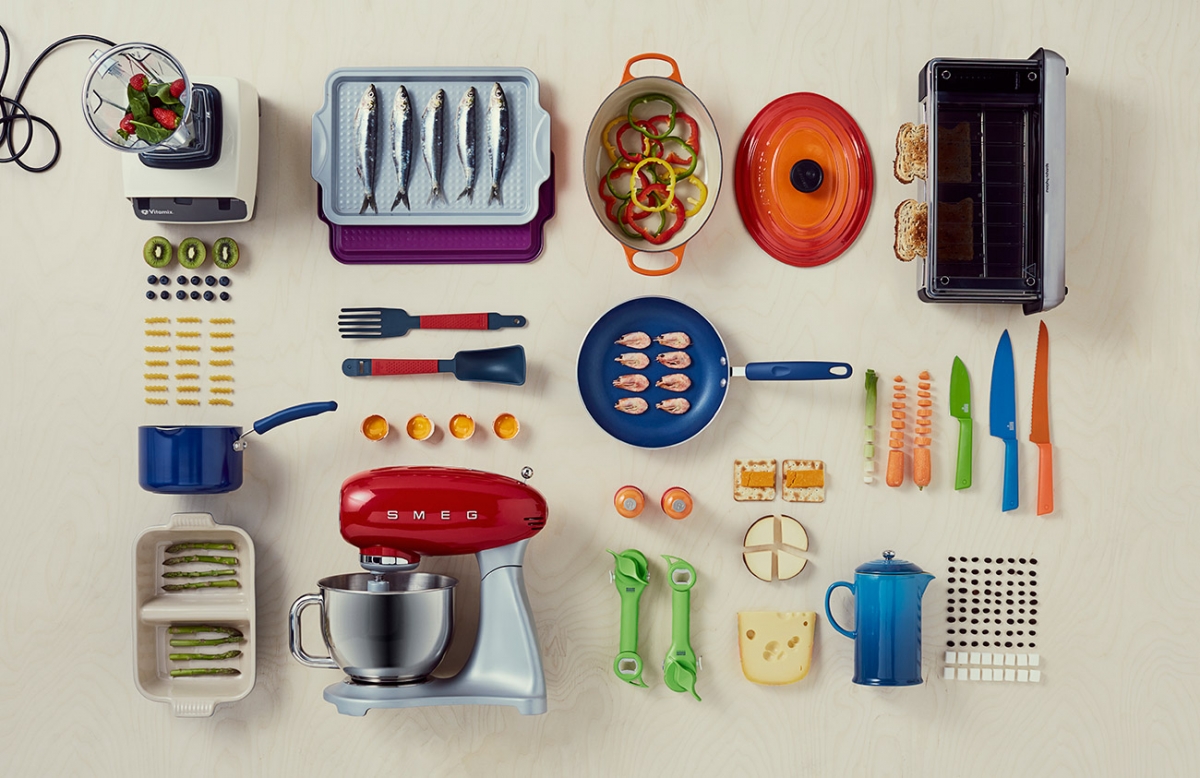
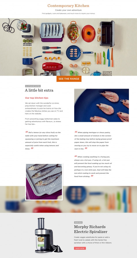
- Buying Guide for Home -
Project: Photoshoot, Landing Page Design
Date: 2016
Industry: Interior Design, Home Decor
The concept revolved around the idea of an online editorial for interior design. The bespoke page consisted of a number of different moods that could be recreated for furniture products at home, based on different brands, seasons of the year and the products in stock. Every style had a specific title that expressed a certain look and feel.
I created a design template that could be used for every style, with slight variations that would depend on the featured content. Then, over a longer period of time I provided creative direction for photography and designed the specific styles using imagery from the photo shoots and editorial content from copywriters.


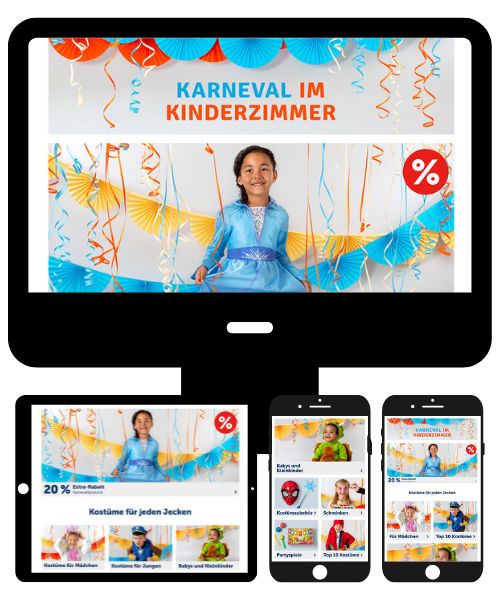
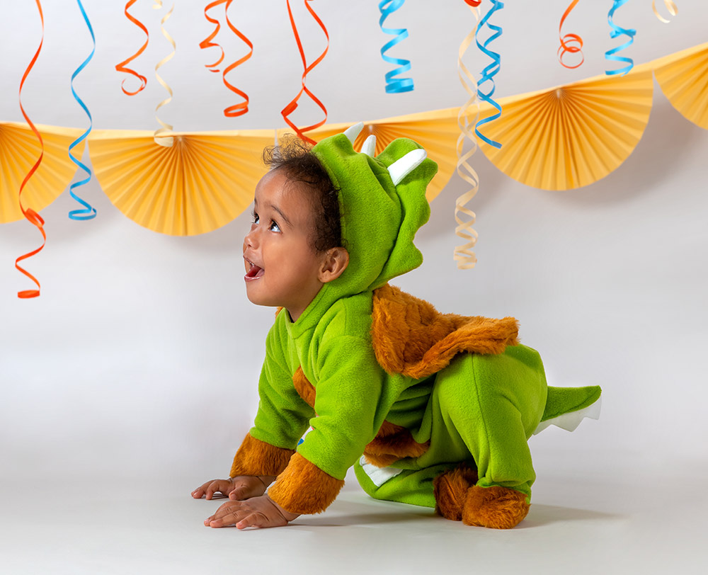
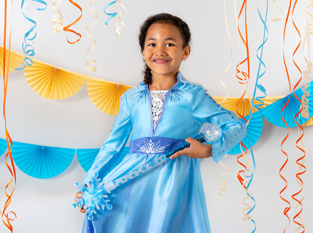
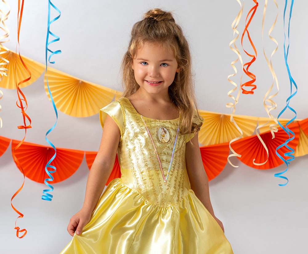
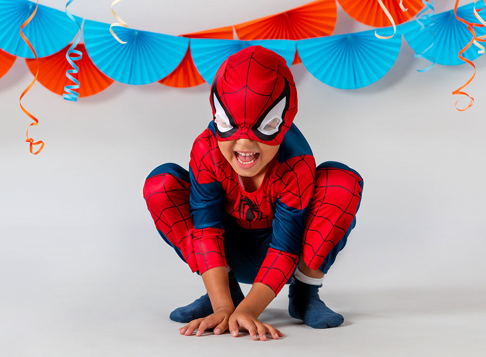
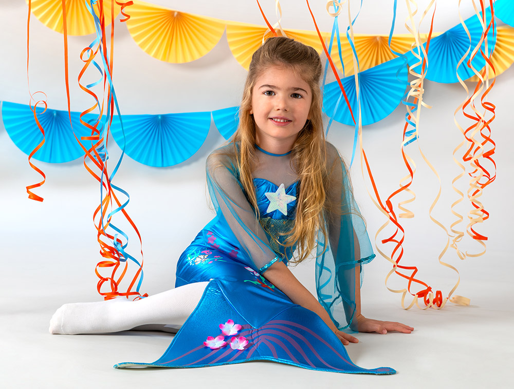
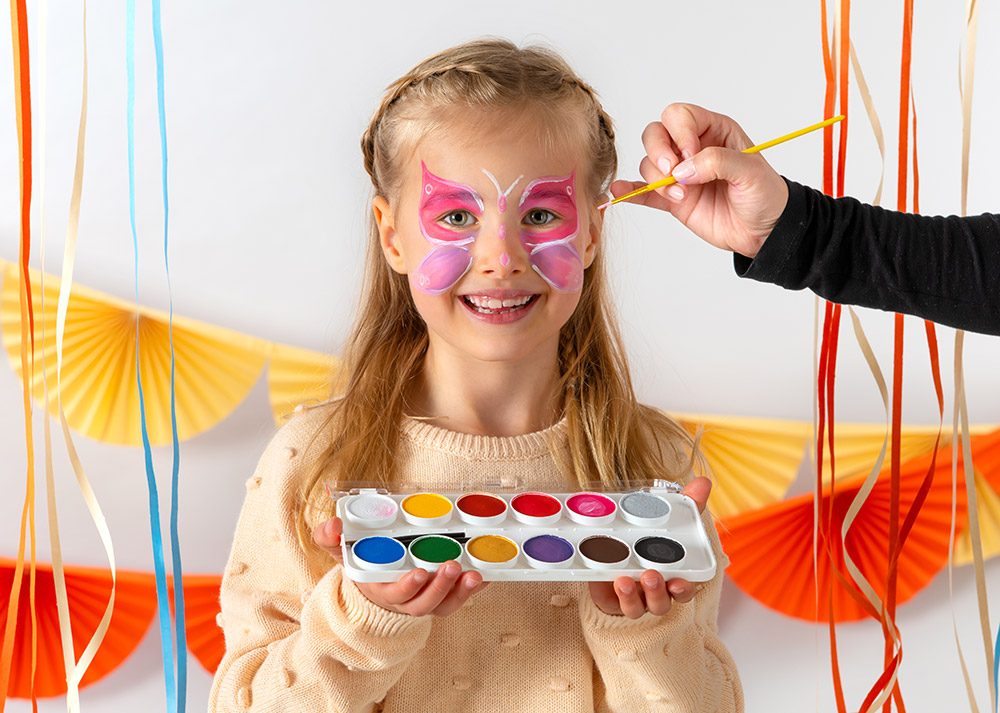
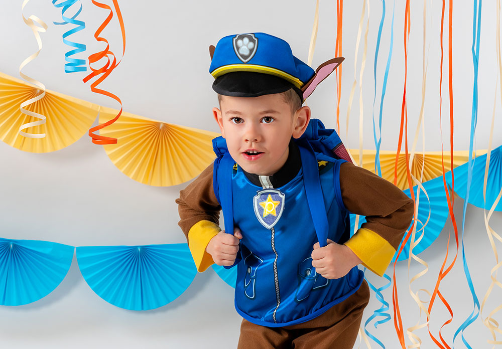
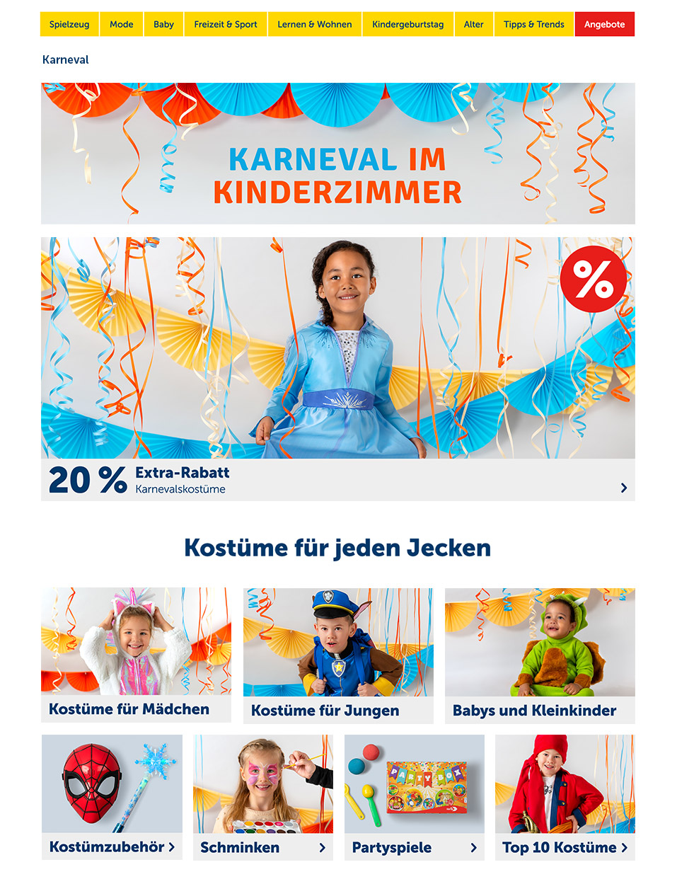
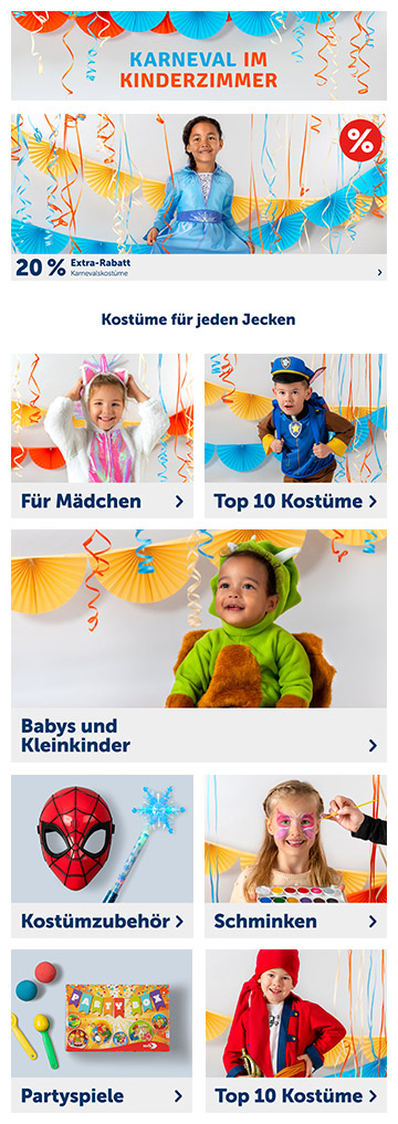
Kids' Carnival
Project: Photoshoot, Landing Page Design
Date: 2019
Industry: Toys, Kids' Fashion
The time of the Carnival in winter is a time of joy and playfulness. I tried to re-create this atmosphere in collaboration with the in-house photo team. We hung colourful paper streamers in front of a light background to balance out the vibrant decorations and costumes against the background. The challenge was to focus on the costumes and to prevent the overall composition from getting messy due to the many colours and decorations.
It turned out choosing a light plain background in grey for a colourful campaign was the right decision. It made the imagery look orderly and more high-quality. At the end I was very happy and satisfied with the result.


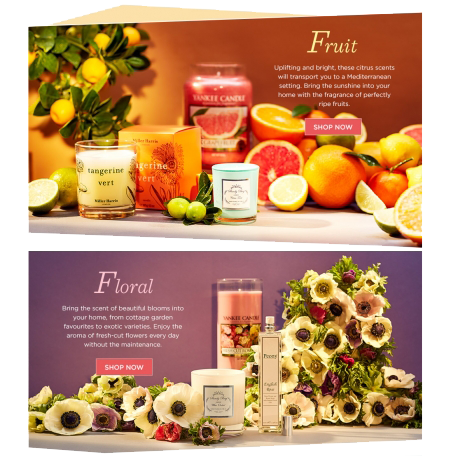
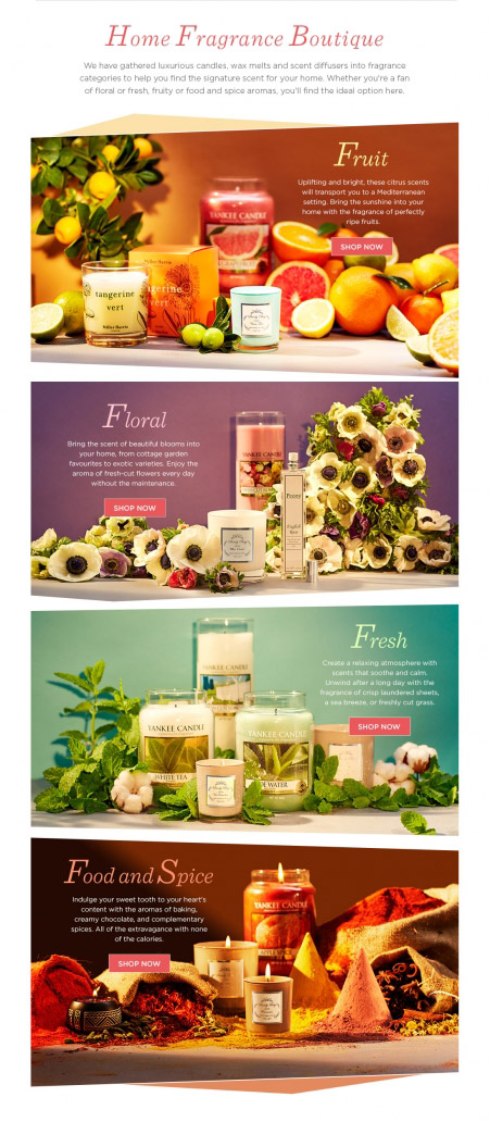
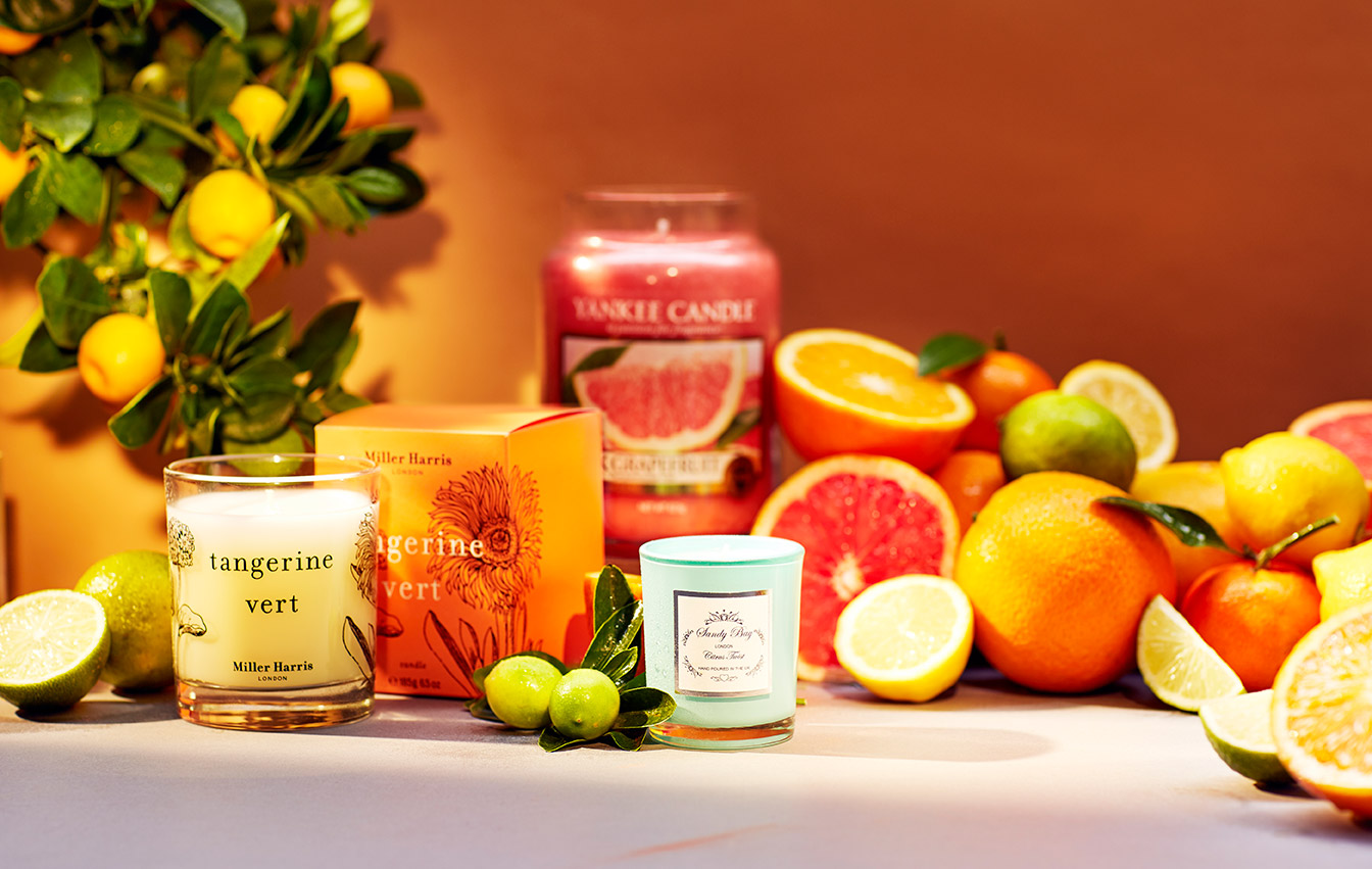
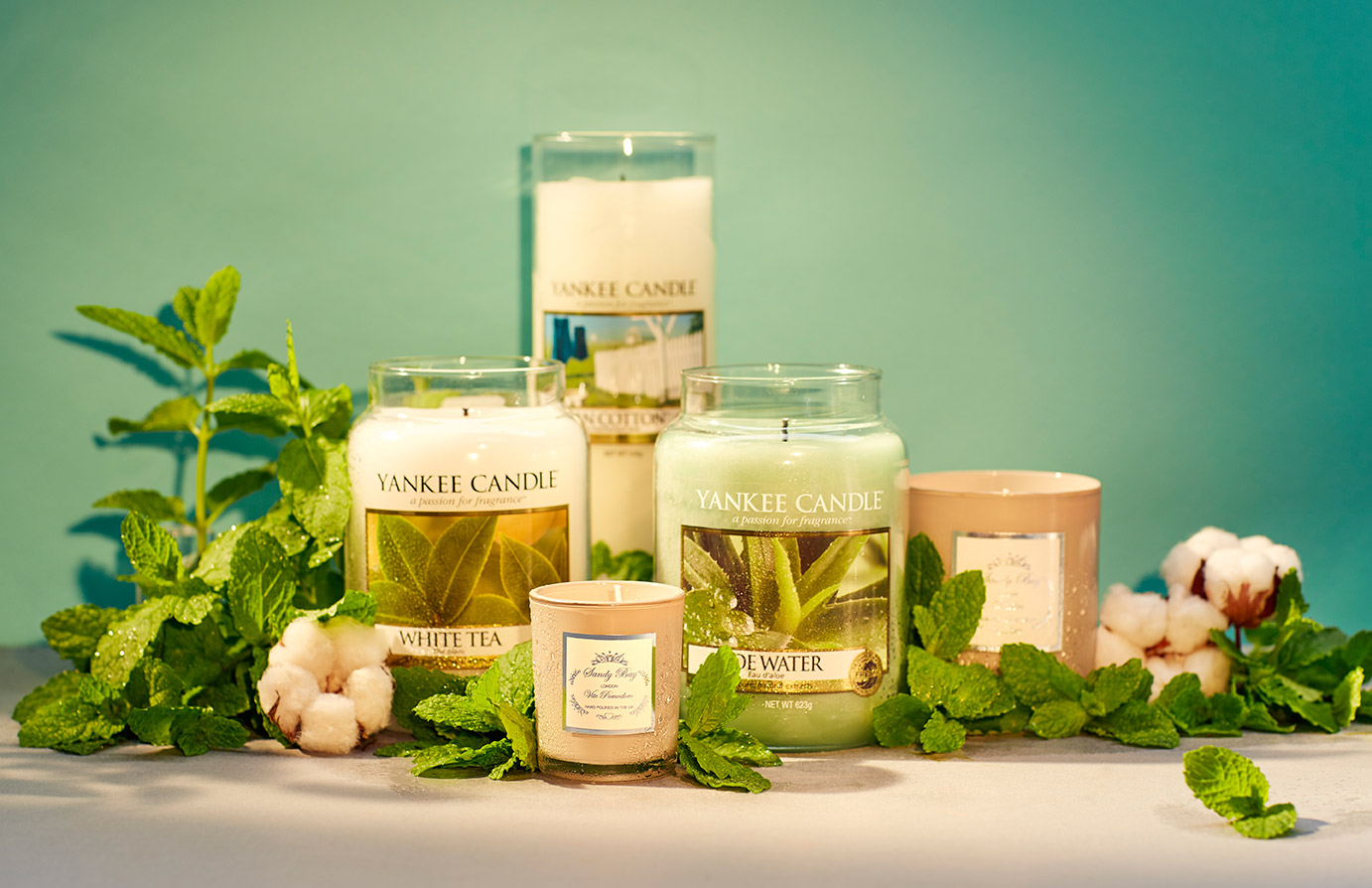
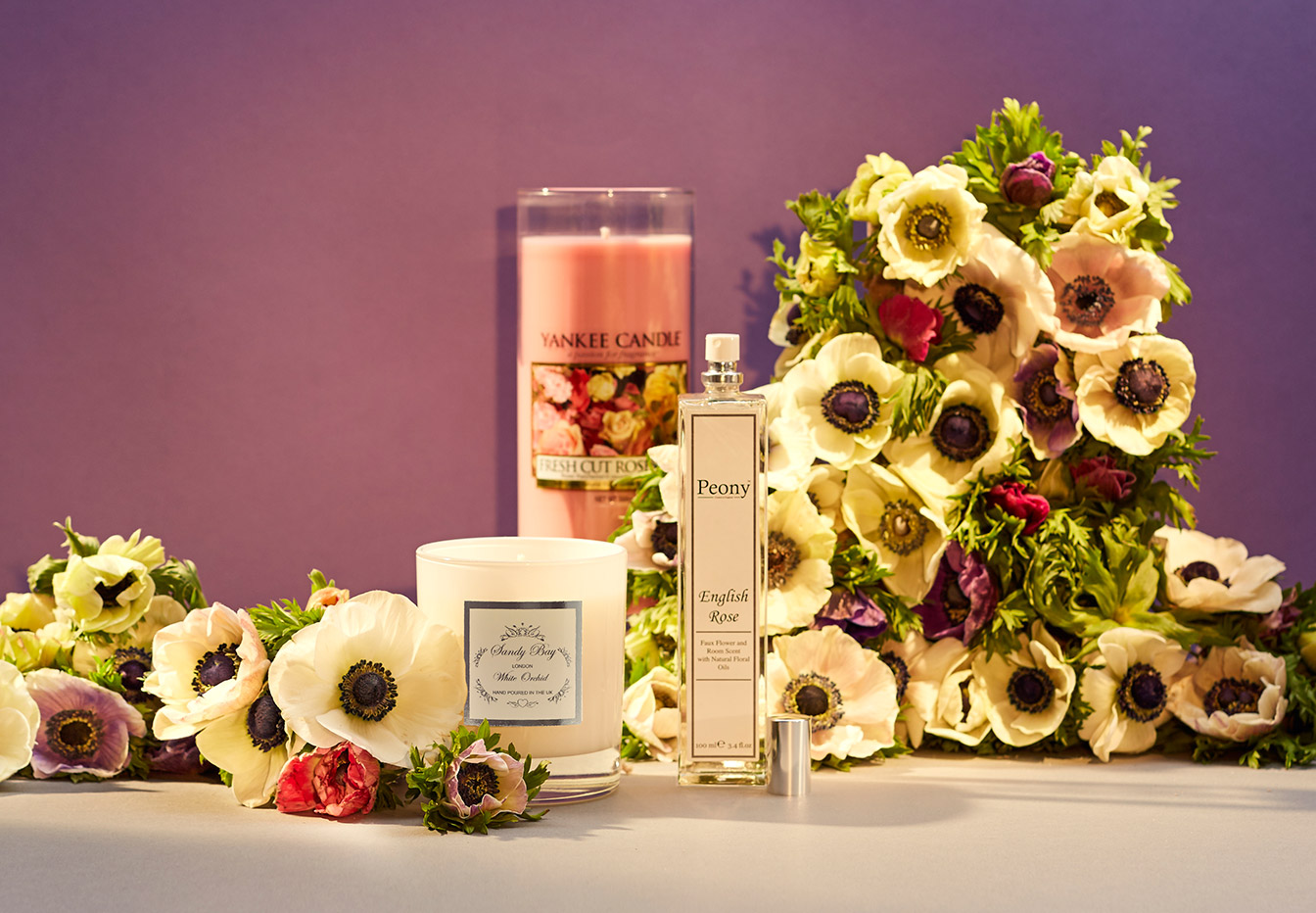
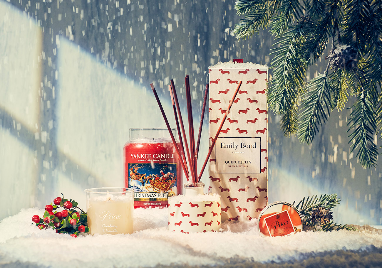
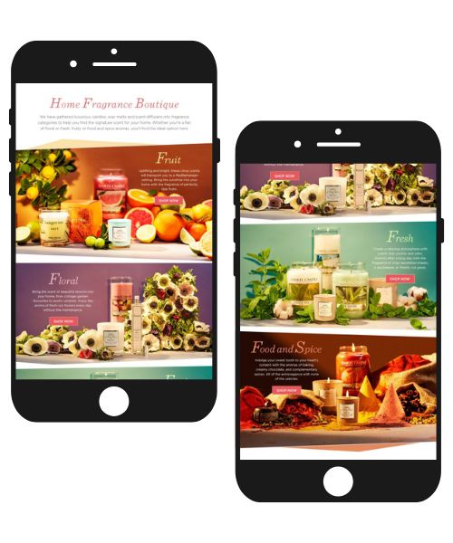
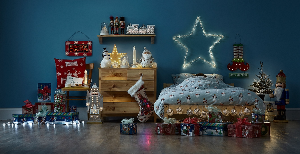
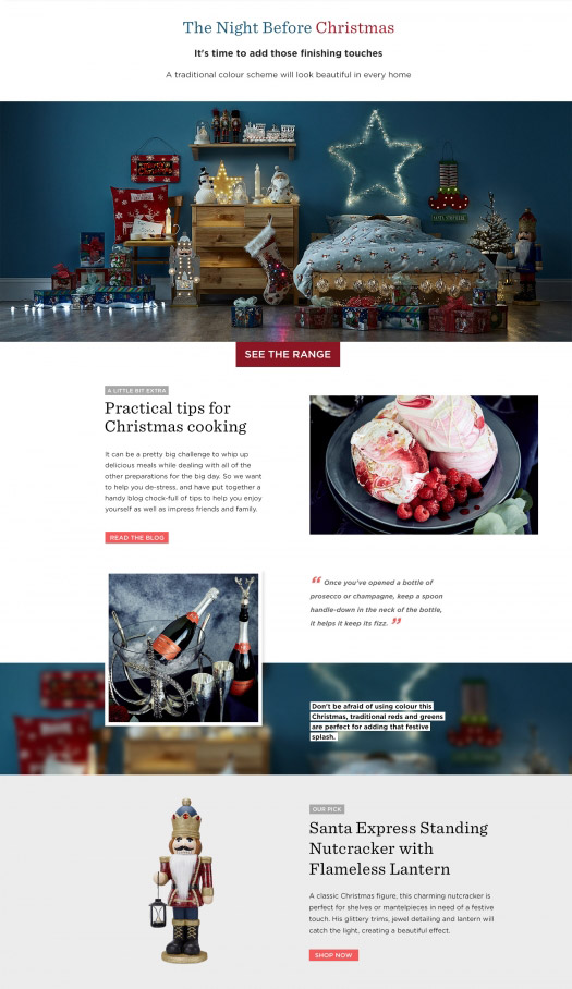
Home Fragrance Boutique
Project: Photoshoot, Landing Page Design
Date: 2015
Industry: Home Decor
This one pager promoted various scent candles and related products for home. The goal was to utilise vibrant colours and large imagery to evoke associations with certain sensory stimuli. We wanted the viewers to 'taste' and 'feel' the scents. That's why we came up with a concept of 4 styles: fruit, floral, fresh and spicery. Later, we also added an extra section for the festive season. I provided creative direction for photography and using the in-house made photos I designed the page.